


Beautiful Unusual Navigation Designs for Inspiration. Selection of Awwwards websites with a strong presence of unusual navigation. An effective navigation design is crucial for a website
Via Martin (Marty) Smith
Get Started for FREE
Sign up with Facebook Sign up with X
I don't have a Facebook or a X account


 Your new post is loading...
 Your new post is loading...
Your new post is loading...
Beautiful Unusual Navigation Designs for Inspiration. Selection of Awwwards websites with a strong presence of unusual navigation. An effective navigation design is crucial for a website Via Martin (Marty) Smith 
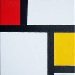
Since my first site design in 1999 was based on a Modrian grid I love this new trend. Marty Robin Good: If you have not noticed yet, the next design trend is all about “undesign”.
"Undesign, a minimalist, tablet-friendly approach to website design."
It's not, like Dylan Tweney writes on Venturebeat, that design has become less important, but rather that it is receding in the background to leave space for direct access to content.
"Instead of pages crowded with links, buttons, and display type of all different sizes, designers were simplifying their layouts. The smartest designers stripped away the nonessential elements of their designs, leaving clean pages that let the eye focus on whatever images or words had been put there by writers and editors.
Why?
Because if the designers didn’t simplify their web pages, readers were going to use utilities like Readability and Instapaper to do it for them."
...
"One of the first apps to embrace this sort of rectangularity was Flipboard, which launched in mid-2010. It transformed the process of browsing RSS feeds into a magazine-like experience by putting stories into a boxy, more readable layout.
Last year's big fashion trend was the color block, and this year's tech trend follows suit: It's the square. More precisely, it's the big, colorful rectangle filled with a solid color (like Windows 8) or a photograph (like Pinterest)."
Right on the mark. 9/10
Full article: http://venturebeat.com/2012/03/07/dylans-desk-design-goes-minimal-online-and-off/ ; Via Robin Good, Johnny E. Ramos Ch., Martin (Marty) Smith
|
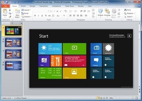
The bundles available at Windows8Templates provide a wide range of PowerPoint Templates with a library of Modern UI elements for making Modern UI prototypes. Via FPPT

FPPT's curator insight,
August 26, 2013 11:39 PM
Great PowerPoint bundle for UX and UI design featuring Metro Design Language from Windows 8 and animations in PowerPoint 
Alex Stout's curator insight,
September 9, 2013 9:18 AM
I don't really like the windows 8 User interface as they have just caterd for the people with touch screen tablets and monitors. I don't really like the idea of no start button at the bottom as it makes getting to places that were easy to get to a lot harder than it previously was on Windows 7. Although I hear that they are planning to add it back in an system update for Windows 8 |


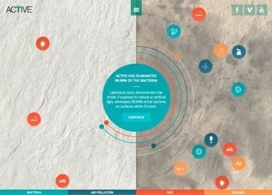
Navigation feels old and moldy. There are few things MORE critical than navigation. We've moved from left nav sitting firmly in the "golden triangle" to horizontal top navigation.
Neither of these options inspire and both are feeling long in the tooth and stupid. The social / mobile web requires a RETHINK about navigation. Can we find ways to make very page a homepage?
Can navigation be more relevant and less middle of the road boring? Here are some navigation examples from AWWWARDS.com that don't solve the problem...yet. But the dialogue helps begin the process of reducing our dependency on static, boring, "has-been" ideas like left or horizontal nav.
Are you as surprised that navigation hasn't been on the "top changes" list for web design in 2014? Has to be on our 2015 list because every current option is BAD and getting worse.
Merci ! il est bon de repenser aussi le webdesign pour une nouvelle expérience utilisateur