
Much has been written about the use of colour in web design. Back in the day there were stark warnings. Pick as few as possible, seemed to be the general advice, and be sensible about your choices.
I covered the main points when I wrote about colour and web design five years ago. A lot of that advice still stands up but there has been a definite shift, and nowadays it seems that more and more designers are embracing colour like never before. The polychromatic web is upon us!
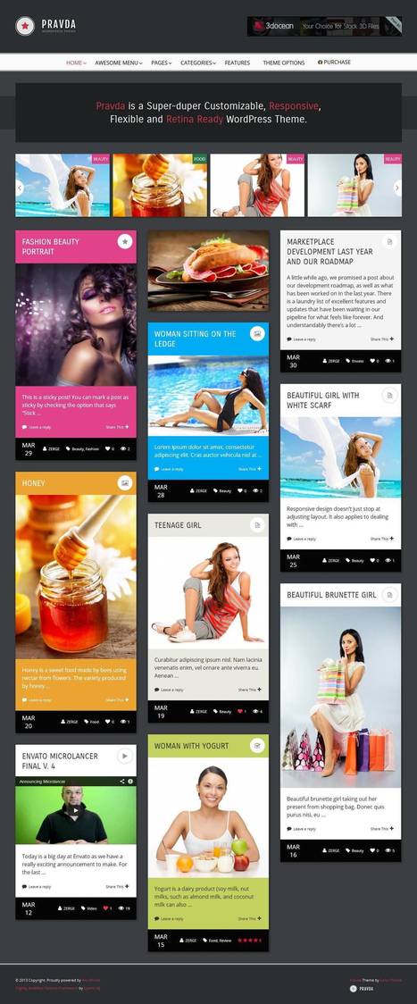
The combination of flat design and blocks of saturated colour is certainly a winning combination from where I’m sitting. It's a trend that is perhaps underpinned by the growing number of devices with retina screens in circulation.
A strong, clever use of colour can be great for branded web experiences, web apps of various flavours, and agency websites. That said, I’m not fully convinced that this design trend is ideal for retailers with hundreds or thousands of product pictures, as too much colour can be overpowering, but no doubt there are some good examples out in the wild.


 Your new post is loading...